The 7 Best Data Visualization Tools in 2026
The best visualization tool is the one that gets the right chart in front of the right people with the least effort. Here is how today’s options compare, from AI chart makers to enterprise BI.
 By Better Analyst12 min read
Disclosure: Better Analyst publishes this blog and makes the first tool on this list. We judged every tool on the same criteria and list the trade-offs for each, including our own.
On this page
The short answer
Better Analyst is the best data visualization tool for most teams: it picks and builds the right chart from your data, lets you refine it in plain English, and turns it into a shareable dashboard. Use Looker Studio for free dashboards on Google data, Datawrapper for publication-ready charts, and reserve Tableau or Power BI for large enterprises with dedicated BI teams and budgets.
Top picks at a glance
| # | Tool | Best for | Starting price |
|---|---|---|---|
| 1 | Better Analyst | AI-built charts and dashboards from your own data | Free; Starter $20/mo |
| 2 | Looker Studio | Free dashboards on Google data sources | Free; Pro $9/user/project/mo |
| 3 | Excel & Google Sheets charts | Quick charts from a small table | Included with your suite |
| 4 | Datawrapper | Clean, publishable charts and maps | Free; Custom from $599/mo |
| 5 | Flourish | Animated and interactive stories | Free (public projects); paid plans |
| 6 | Canva | Charts inside designed graphics | Free; Pro plans available |
| 7 | Tableau & Power BI | Large enterprises with BI teams | Enterprise licensing |
Prices are published list prices as of October 2026 and may change.
How we chose
We compared each tool on the work that actually decides whether a chart gets made and used, based on each vendor’s published features and pricing:
- Time to first chart: how quickly someone without design or BI training gets a correct, readable chart.
- Chart range: the basics plus distributions, relationships, maps, and flows.
- Data access: spreadsheets, databases, and apps, and whether charts refresh.
- Sharing: dashboards, embeds, exports, and presentation-ready output.
- Total cost: licenses for builders and viewers, plus the setup and upkeep time.
The 7 best data visualization tools
Better Analyst
Our pickThe fastest way from raw data to the right chart. Better Analyst analyzes your data, chooses a chart that answers your question, and builds it, then turns it into a dashboard when you are ready.
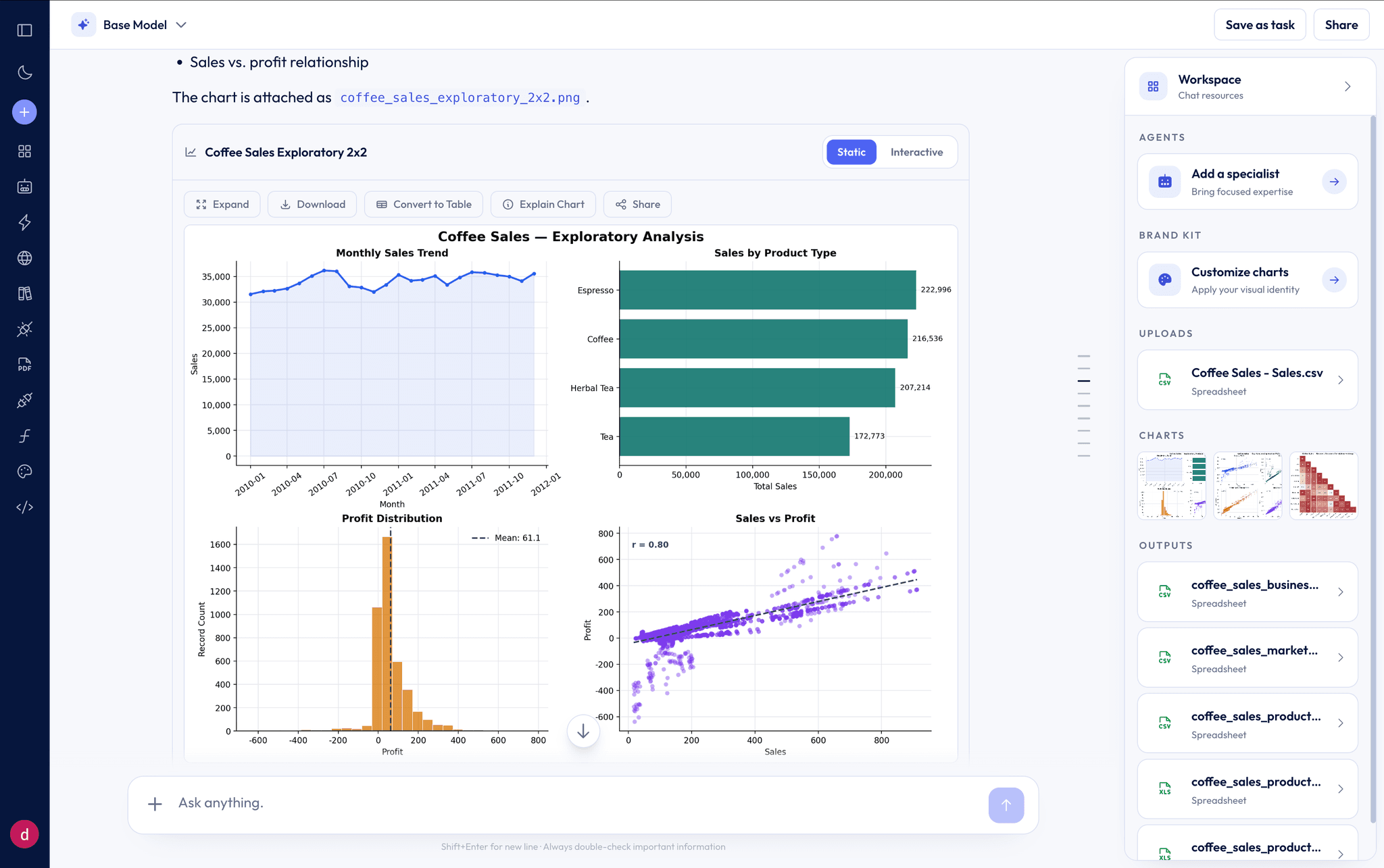
Most visualization tools hand you a blank canvas and a list of chart types. Better Analyst starts from the question. Ask “How did revenue trend by region this year?” and it prepares the data, picks a chart, and explains its choice. Then you iterate: “Make it a stacked area,” “Highlight the West,” “Use our brand colors.”
When a chart becomes something people check every week, save it to a dashboard that refreshes from your connected data, or turn the analysis into slides.
- Best for
- Teams who need clear charts and dashboards without a BI specialist
- Pricing
- Free plan included. Starter $20/mo, or $14/mo billed yearly. Max $40/seat for teams; Business $80/seat adds embedded analytics.
What we like
- Describe the chart in plain English and refine it the same way
- Advanced charts beyond the basics, including heatmaps, violin plots, and pair plots
- Interactive charts with hover and zoom, plus click-to-edit styling and brand themes
- Dashboards from a spreadsheet or a live connector, with scheduled refreshes
- Embed white-label analytics in your own product on the Business plan
Watch out for
- Built for analysis and dashboards, not pixel-perfect editorial graphics
- Teams with a mature BI stack may use it alongside existing tools rather than replacing them
Looker Studio
Google’s free dashboard builder. A solid choice when your data already lives in Google Analytics, Google Sheets, or BigQuery.
- Best for
- Marketing and web teams reporting on Google data
- Pricing
- Free. Looker Studio Pro is $9 per user, per project, per month.
What we like
- Free to start with native Google connectors
- Easy to share report links
- Large library of community templates
Watch out for
- You design every chart and layout by hand
- Reports can slow down on large or blended data sources
- Limited statistical and advanced chart types
Excel & Google Sheets charts
The charts you already have. Perfect for a quick bar or line chart from a small, tidy table.
Not sure which chart to pick? Our guide to 33 types of charts and graphs explains when to use each one.
- Best for
- Simple charts from data already in a spreadsheet
- Pricing
- Included with Microsoft 365 or Google Workspace (Google Sheets is also free for personal use).
What we like
- No new tool to learn
- Charts stay next to the data
Watch out for
- Manual setup and formatting for every chart
- Limited interactivity and advanced chart types
- Sharing a live view means sharing the whole file
Datawrapper
A favorite of newsrooms for clean, responsive charts, maps, and tables that look good on any screen.
- Best for
- Publishing charts on a website or in articles
- Pricing
- Free plan with unlimited charts. Custom plan from $599/mo for teams.
What we like
- Beautiful defaults with very little effort
- Responsive embeds and accessible output
- Generous free plan
Watch out for
- Expects prepared data; it does not analyze or clean it
- Not designed for interactive business dashboards
Flourish
Great for animated, story-driven visuals like bar chart races and scrollytelling. Flourish is part of Canva.
- Best for
- Communications and storytelling projects
- Pricing
- Free plan for public projects. Paid plans for private projects and teams.
What we like
- Distinctive animated and interactive templates
- No code required to publish
- Easy embedding
Watch out for
- Free projects are public
- Template-driven, so custom analysis happens elsewhere
Canva
Add simple charts to social posts, slides, and reports that need to look designed.
- Best for
- Marketing graphics and presentations
- Pricing
- Free plan. Canva Pro and team plans available.
What we like
- Charts sit inside polished designs
- Huge template library
Watch out for
- Manual data entry or small imports
- Not a tool for analysis or live data
Tableau & Power BI
Enterprise BI platforms built for large organizations with dedicated BI developers, governed data models, and enterprise budgets.
Both are strong platforms for the enterprises they were built for. For most small and mid-sized teams, though, the real cost is not the sticker price. It is the training, data modeling, and ongoing maintenance needed before anyone sees a useful chart. An AI-first tool like Better Analyst gets most teams to a shareable dashboard in an afternoon.
- Best for
- Large enterprises standardizing BI across many departments
- Pricing
- Enterprise licensing. Tableau Creator lists at $75/user/mo billed annually; Power BI needs a paid license for every viewer unless you buy capacity.
What we like
- Deep governance, modeling, and admin controls
- Large ecosystems and certified talent pools
Watch out for
- More expensive in practice: builder and viewer licenses, capacity, and the BI team to run them add up
- Steep learning curve; dashboards usually need a trained developer
- Slower time to first chart for small teams
How to choose a data visualization tool
- Step 1Name the audienceA chart for an executive, a customer, or a newspaper reader needs different polish, interactivity, and sharing.
- Step 2Check where the data livesIf your data is in databases or apps, choose a tool that connects to it directly and refreshes.
- Step 3Decide who buildsIf non-specialists will make charts, favor tools that build from plain-English requests.
- Step 4Look past the basicsMake sure the tool covers the charts you will actually need, from histograms to maps.
- Step 5Price builders and viewersCount every license, including people who only view dashboards.
- Step 6Test with a real questionUse a free plan to answer one real question end to end before you commit.
Describe the chart. Better Analyst builds it.
Upload a spreadsheet or connect a data source, ask for the view you need, and get an interactive chart or dashboard in minutes.
No credit card required. Free plan included.
Frequently asked questions
Keep reading
More from the Better Analyst blog
33 Types of Charts and Graphs: Examples and When to Use Each
Compare 33 chart and graph types, see practical examples, and learn which visualization fits your data.
Read moreThe 7 Best Analytics Software Tools in 2026
Compare the best analytics software for small teams and growing businesses: AI analysis, dashboards, connectors, automation, and real costs.
Read moreThe 7 Best AI Tools for Excel in 2026
We compared the leading AI tools for Excel on formulas, analysis, charts, file support, and price. Here is which one fits your spreadsheet work.
Read more